CASE STUDY
Project HEAL
Overview
Project HEAL is a national non-profit dedicated to breaking down barriers to eating disorder treatment. While the organization had a strong mission and preferred colors and fonts, their visual tone was inconsistent. Without formal rules, their materials lacked the consistency needed to gain trust from major donors and clinical partners.
My Role as Brand Designer and Strategist
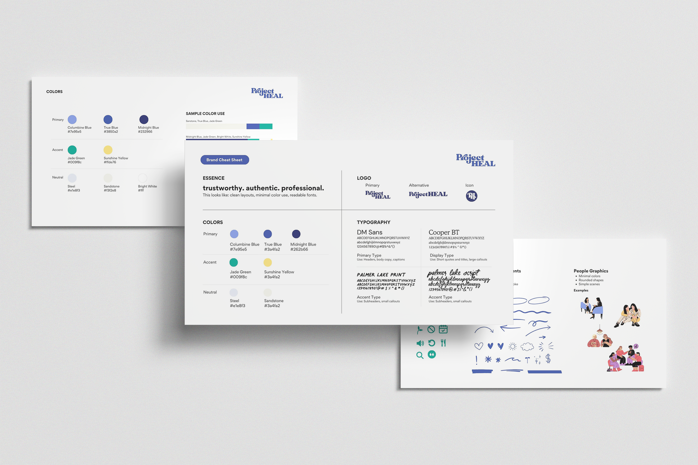
I led a brand refresh to transform a loose visual identity into a formal, professional structure. My goal was to preserve the brand personality the team loved while building the assets and templates needed to keep everything aligned. I developed a comprehensive brand guideline designed for daily use by the entire team. This ensures that every deck, brochure, and social post feels like it belongs to the same established organization, regardless of who created it.
Establishing the Rules
I led a brand refresh that took the essence of the brand—the foundational fonts and colors the team loved—and expanded them into a formal, professional structure. I developed a comprehensive brand guideline designed to be an easy, everyday reference for the entire team.
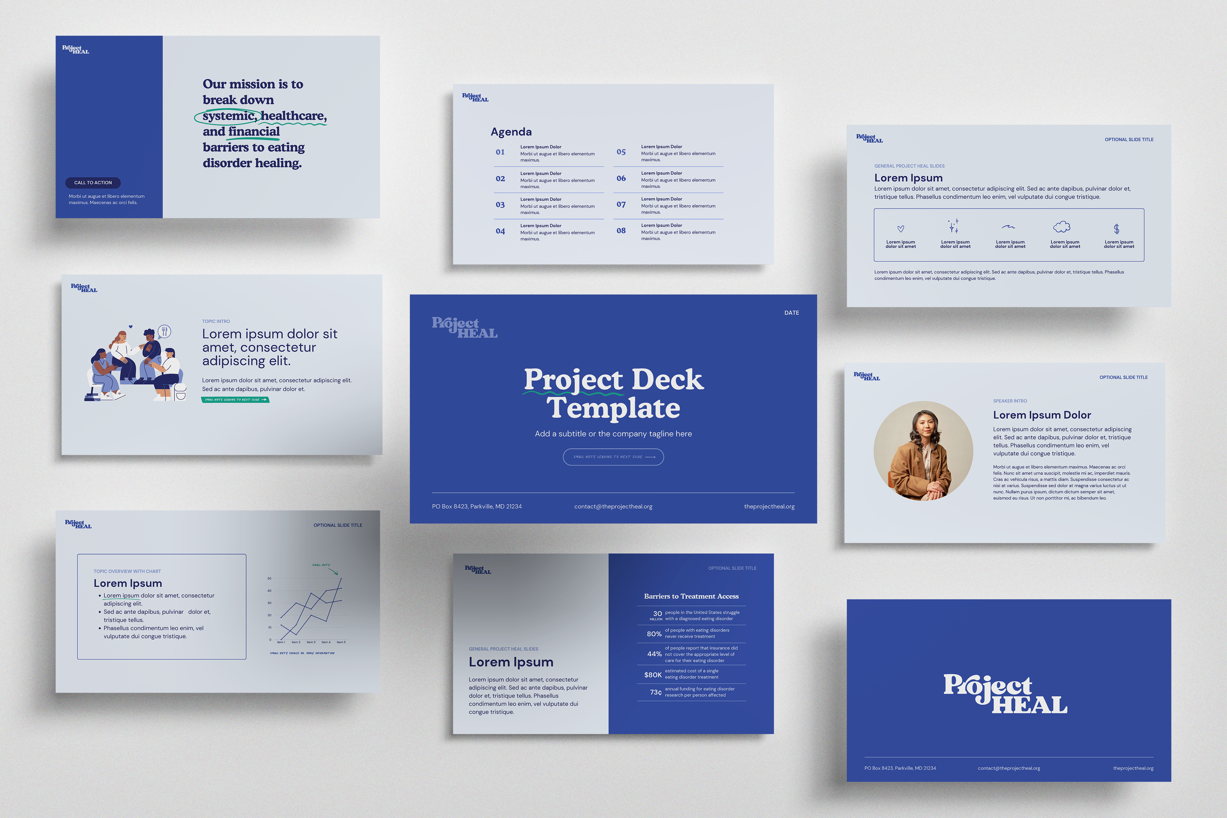
High-Utility Template Deck
I built a "plug-and-play" Google Slides system to support the team’s fundraising and advocacy efforts. The goal was to make it easy for anyone to swap out data or text without breaking the design or losing the professional look.
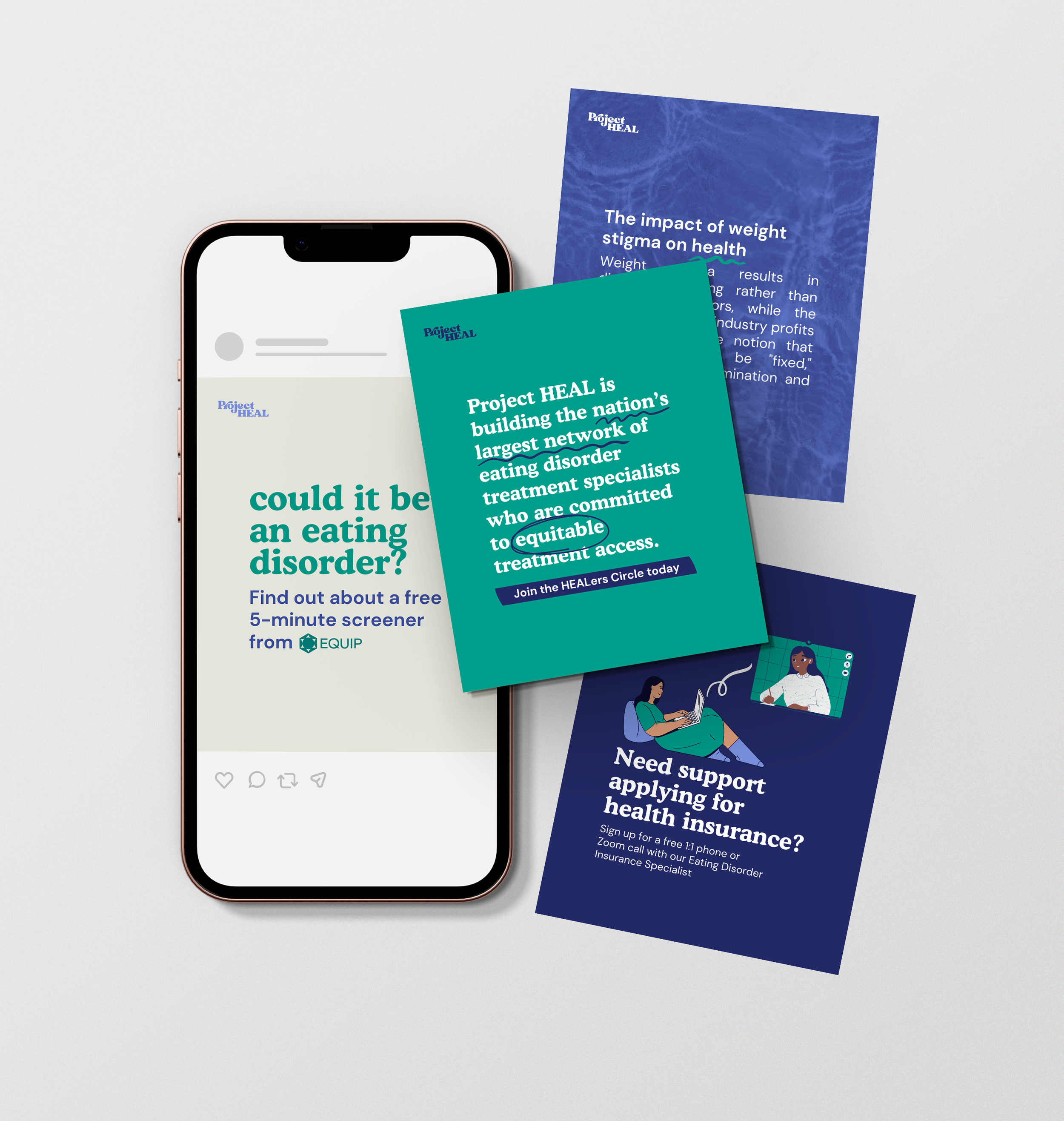
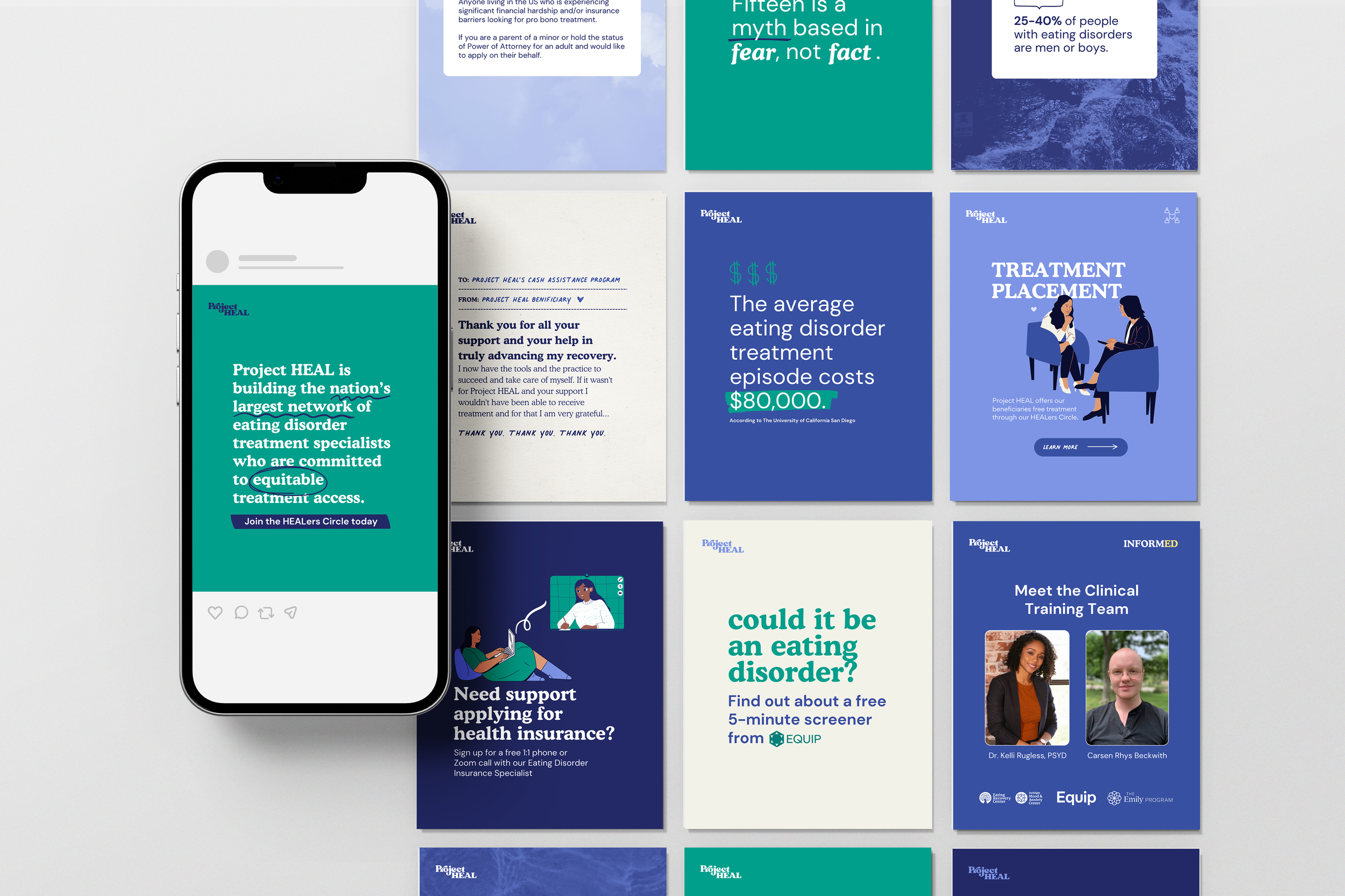
Social Media Kit & Graphics
I translated the refreshed brand into a library of social media assets. By creating a consistent look for their digital channels, I helped move the brand away from "one-off" posts and toward a recognizable digital presence.
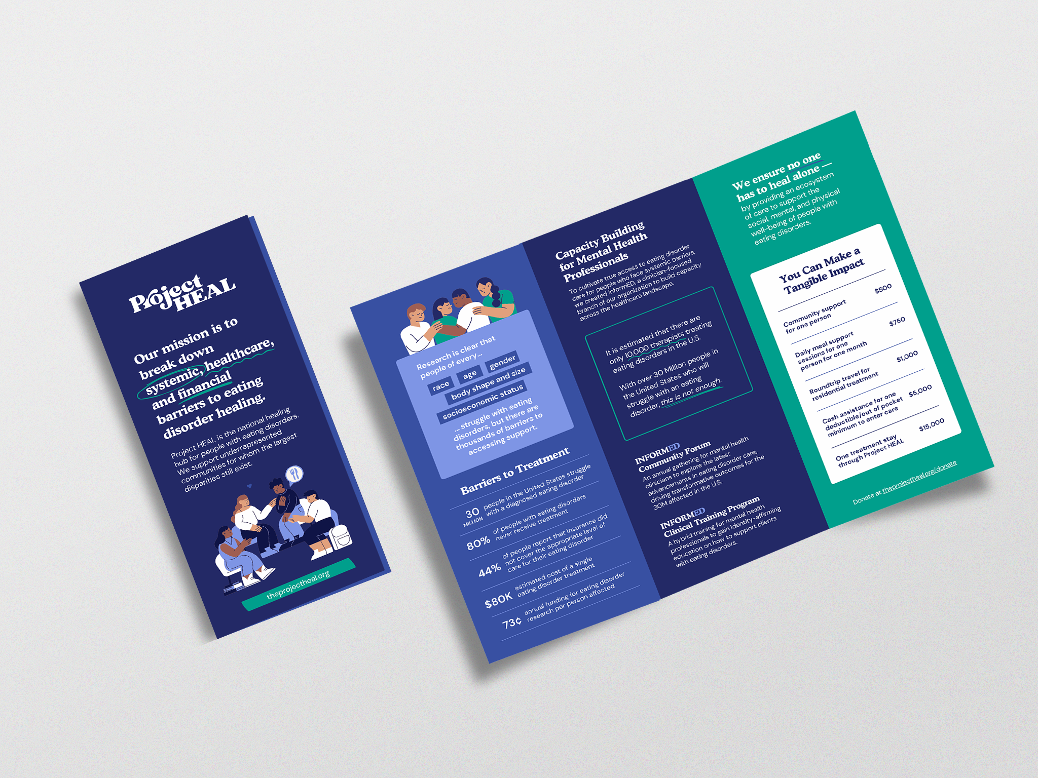
Brochure Design
I focused on a clear visual hierarchy to distill program details into modular segments. This ensures that as programs or contact details change, the team can easily update the content without losing brand integrity.